
Twenty EA
New logomark, new wordmark and a dynamic, bright colour palette.
Meet TwentyEA – the data people
TwentyEA is a powerful and reputable data provider for the property industry. They track over 99% of all residential property listings in the UK and provide valuable data, insights and marketing solutions to estate agents.
Part of the TwentyCi Group, they are well known for producing the quarterly Homebuyers Property & Homemover Report providing a real-time review of the UK residential property market. Whenever you hear or see property stats, chances are they are sourced from TwentyEA.


What was the challenge?
Excellent track record, unrivalled property data experience and an impressive portfolio of products and services, however, TwentyEA’s brand was not able to reflect the business, the awesomeness and enormity of what they do. The brand was also beginning to look tired and a little underwhelming in comparison to their powerful products, delivery and people.
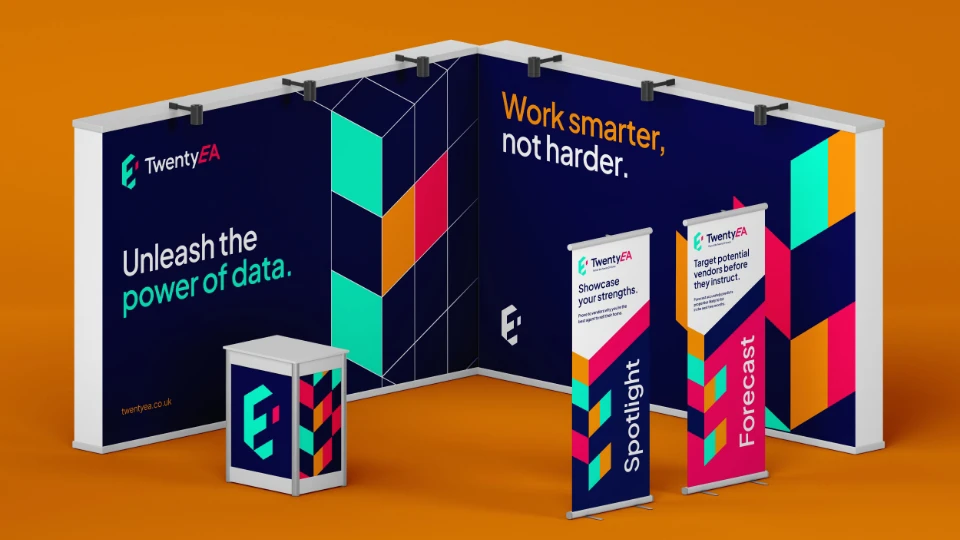
Under the superb direction of Katy Billany, Executive Director, TwentyEA came to us wanting to modernise their brand, create a new logo and develop a new set of Brand Guidelines. They also needed us to design the exhibition materials for the EA Masters Conference in London where they were going to launch the new look brand.
The brief was to make the brand stand out and better represent what they do. Could we make data sexy and appealing? This was exciting and we were ready to give it our best!
A creative approach
When working on branding jobs for estate agents and property businesses, we pool together the most creative minds here at PropertyStream to develop three or more concepts – or design routes – that we present to our clients. The chosen route is then developed further.
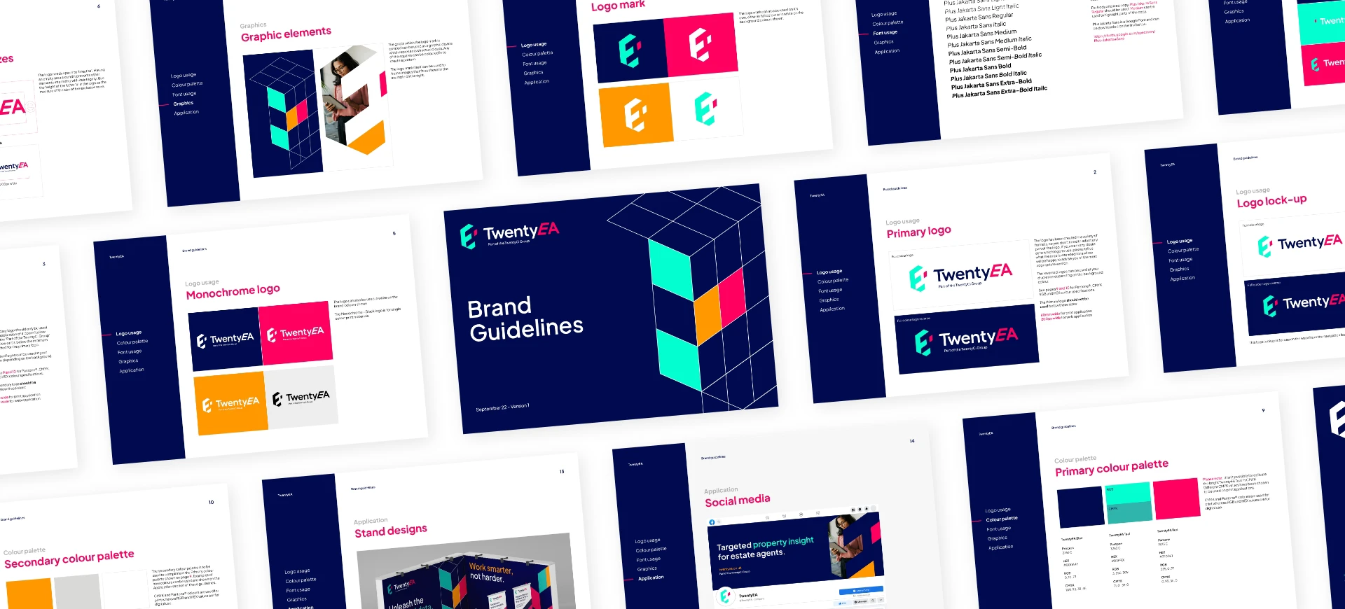
TwentyEA liked all of our concepts and the winning route stems from creating a logo mark from a grid that represents structured data. This helped bring purpose and relevance to the new brand identity to truly reflect the business.


Dynamic results
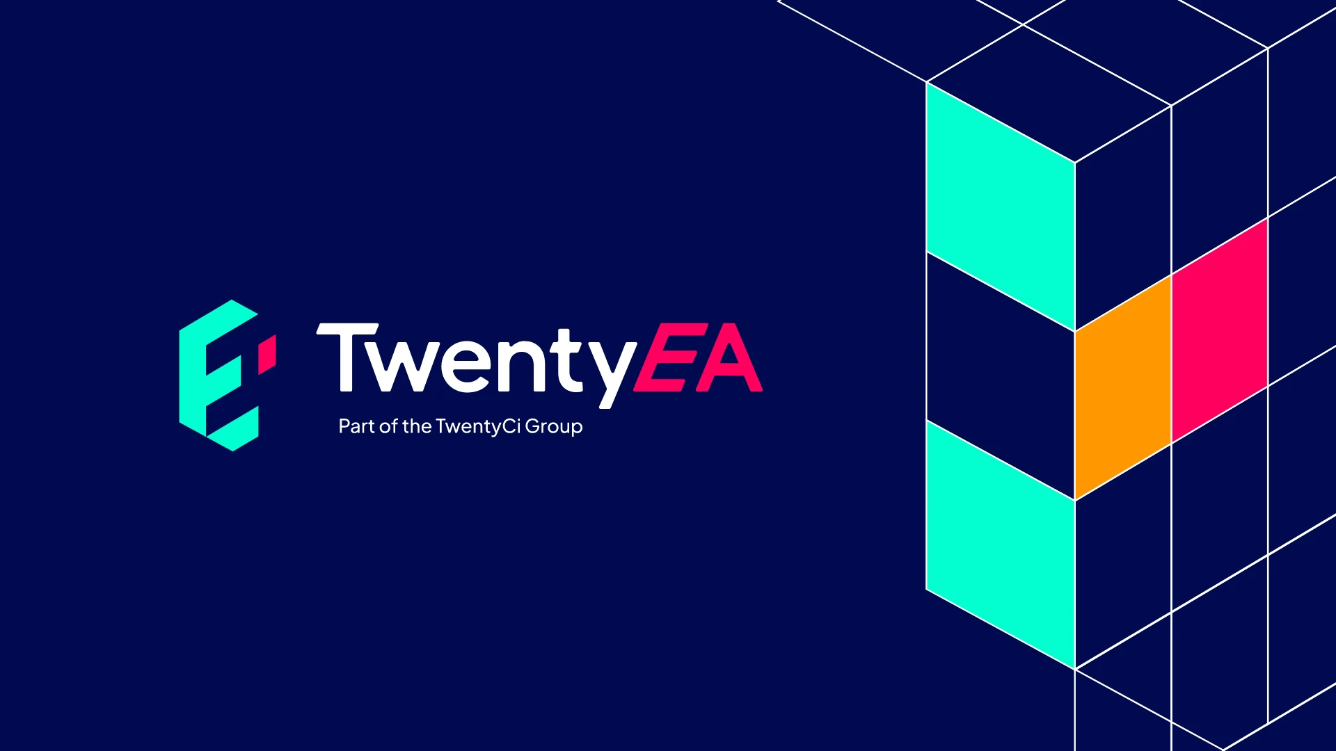
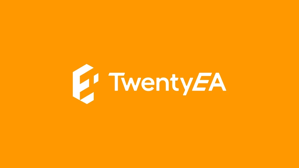
The new logo and brand identity has been designed to be strong and bold, bringing real energy to the brand. Fresh, modern and vibrant are words now proudly associated with the new-look TwentyEA.
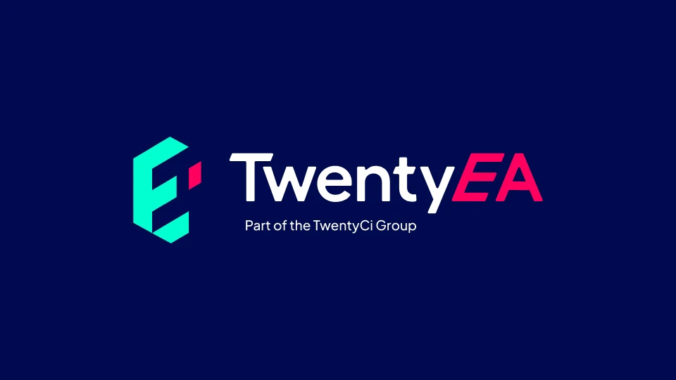
Creatively using negative space – the space around and between objects – we produced a new logomark made with the E and the A from the new grid blocks. The logo wordmark is made up of the logomark EA sitting at the end of the word Twenty in a slightly slanting style to create TwentyEA. This tilt symbolises forward thinking, a crucial aspect of this dynamic data company.
Flexibility and choice
The logo is designed so it can be used as a graphic device to house images and create patterns. This adds a dynamic and flexible element to their bright and bold new branding, the opportunities and choices for their marketing team are almost endless!
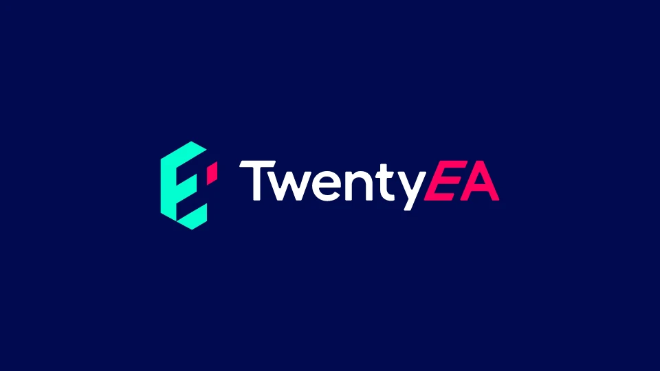
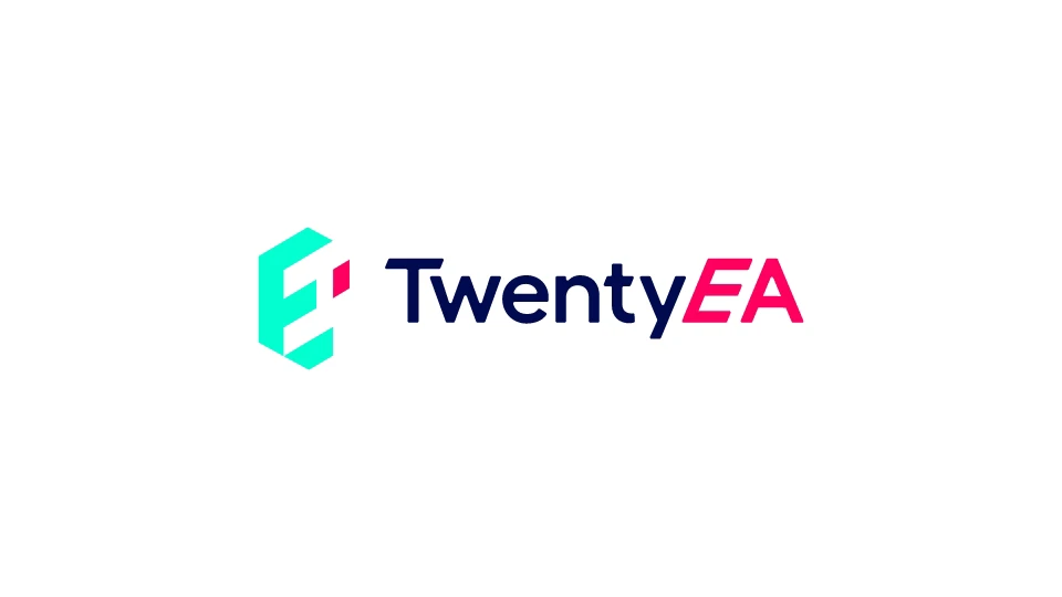
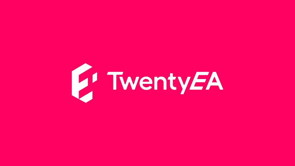
The logo wordmark was created using a modern, fresh font. We then produced the logo wordmark in several colour applications, aligned to their new colour palette, to ensure our client would gain maximum usage across different channels and outputs. A striking shade of teal helps the brand stand out and can act as a powerful conversion colour for online applications.
One key challenge for TwentyEA was the need to highlight their link back to the bigger group TwentyCi as part of their brand identity. We resolved this by creating a logo lock-up that includes ‘Part of the TwentyCi Group’. To help our client achieve brand consistency, we produced a comprehensive Brand Guideline document consisting of colour palette, brand application, logo and font usage.
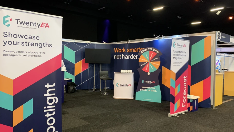
EA Masters showcase
Finally, we were tasked to produce the backdrop and banners for their showcase exhibition stand at the EA Masters Conference and Awards Ceremony in London. We were delighted with the results, as was the client and the unveiling of the new branding went down a storm at this industry leading event. Incidentally, PropertyStream and TwentyEA had adjacent stands at the event, so we were able to admire our branding work all day.
Testimonial
A word from our client
“We were looking to modernise the TwentyEA brand and were keen to find something that better reflected who we are as a business. PropertyStream really took on board our requirements and created some great options for us to choose from. Working with the team was very easy and although we had some tight deadlines to hit, nothing was too much trouble for them. We’re really pleased with the outcome and would recommend PropertyStream to anyone looking for assistance with their branding.”
Katy Billany, Executive Director, TwentyEA
We'd love to work with you.
We can help ambitious brands stand out and earn more with our websites and branding. Discuss a project with one of our specialists today!
Manchester
+44 (0) 333 242 0647
enquiries@propertystream.co
26 Dale Street, Manchester, M1 1FY
Find us on Google Maps
London
+44 (0) 333 242 0647
enquiries@propertystream.co
326 City Road, London, EC1V 2PT
Find us on Google Maps
Copyright © PropertyStream Ltd. 2026. All rights reserved.