
Castles
A clean, sophisticated brand and website.
The challenge
Castles is an independent estate agency that has been operating in the areas of Hemel Hempstead, Boxmoor and Berkhamsted for over 30 years. Putting customers first is a strong focus and while evolving as the years go by, Castles has developed and grown since starting out in 1990.
Over the years, Castles has built up a reputation for providing a property service that prioritises customers. Today, this reputable estate agency is on a trajectory growth path, ambitious to grow and expand.
The brief
Castles came to us wanting to adapt their branding and website to match the market they were targeting – the middle to high end of the property market.
They were looking for a different feel to what they currently had. To make an impact and align brand visual assets they wanted their tone of voice and message to be consistent across all their platforms, to put the customer experience at the heart of the brand and inform and provide advice to users.
Being thought leaders and property experts, Castles aimed to be helpful, insightful and offer educational information through their website.
Our approach
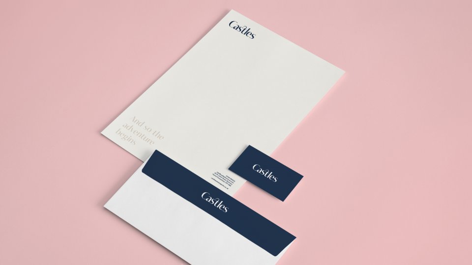
To tweak their current feel and look we looked at combining a rich navy, darker colour to give the brand a more premium feel. At the same time, to keep the website and brand welcoming we wanted to use a complimentary softer palette of colours alongside the rich colour.
For the typography, the introduction of a serif typeface, complemented with a sans-serif typeface, would provide a clean but classic look that would appeal to the target audience – mid to high end property market.
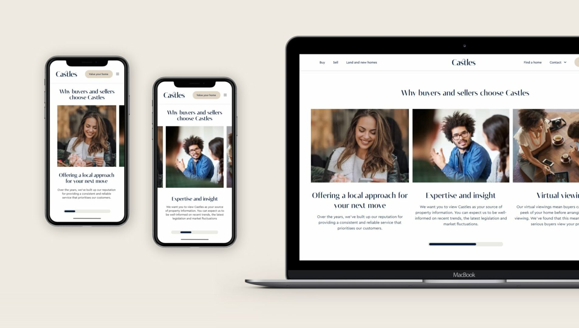
On the user experience side of the website, to keep the information easy to digest and not overwhelm the audience, the content was to be kept minimal. Also, another main focus for Castles was to be available to their customers therefore the addition of a WhatsApp live chat would be implemented.
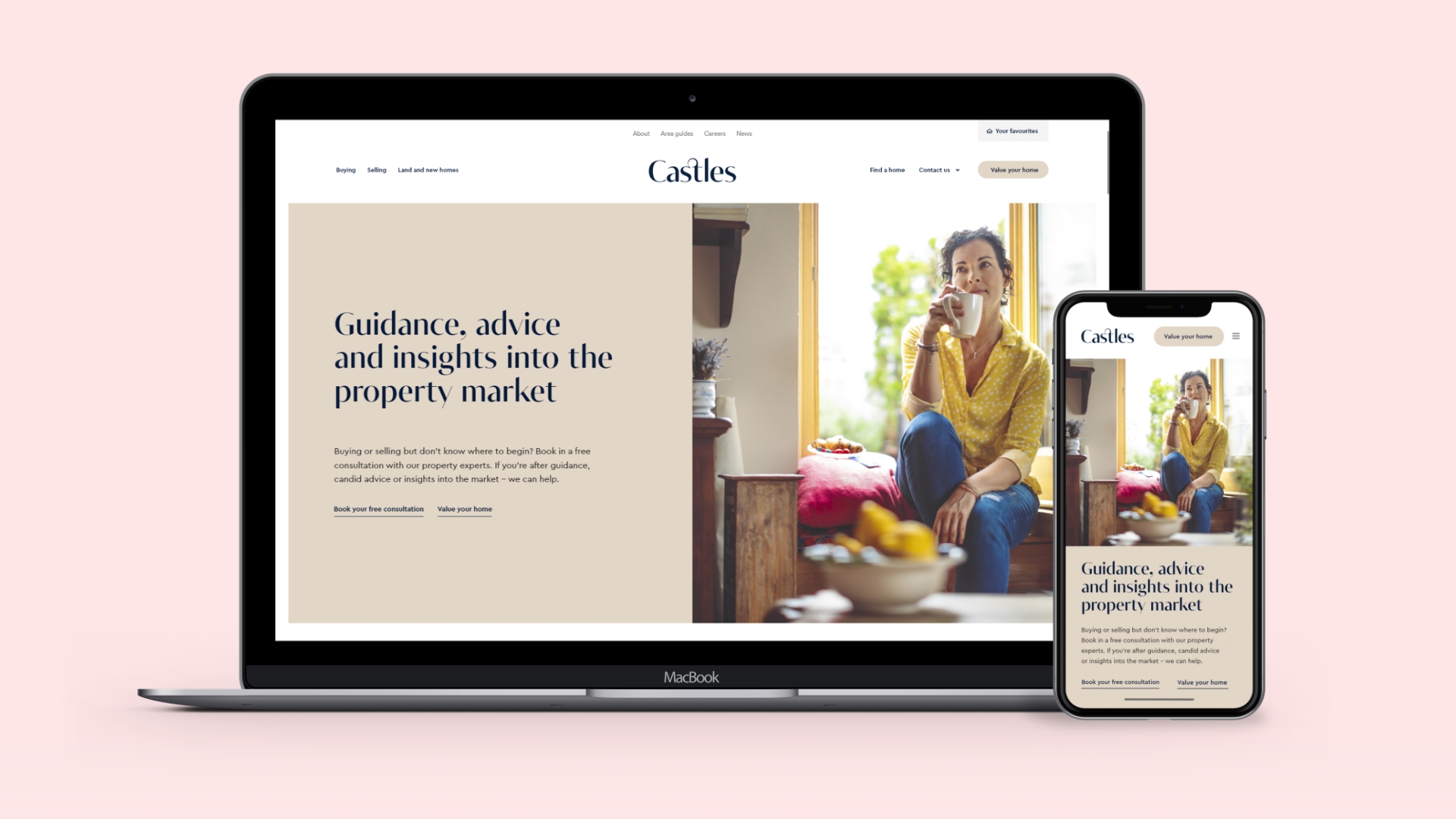
The result
The result is a clean, sophisticated brand and website. The use of a traditional typeface paired with the rich navy and modern pastel colour palette really created the feel they wanted for their target audience.
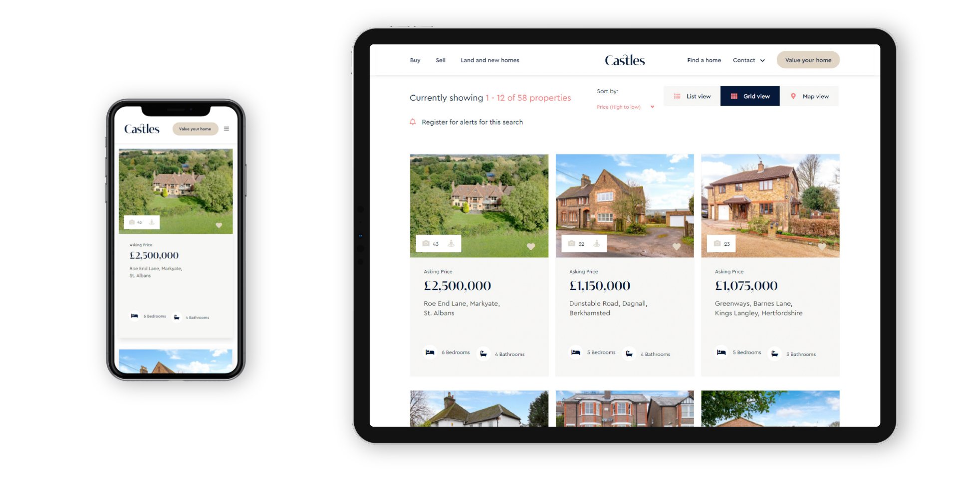
These brand rules paired with a simple site structure provided a clean sophisticated look that made it easy for the user to navigate.
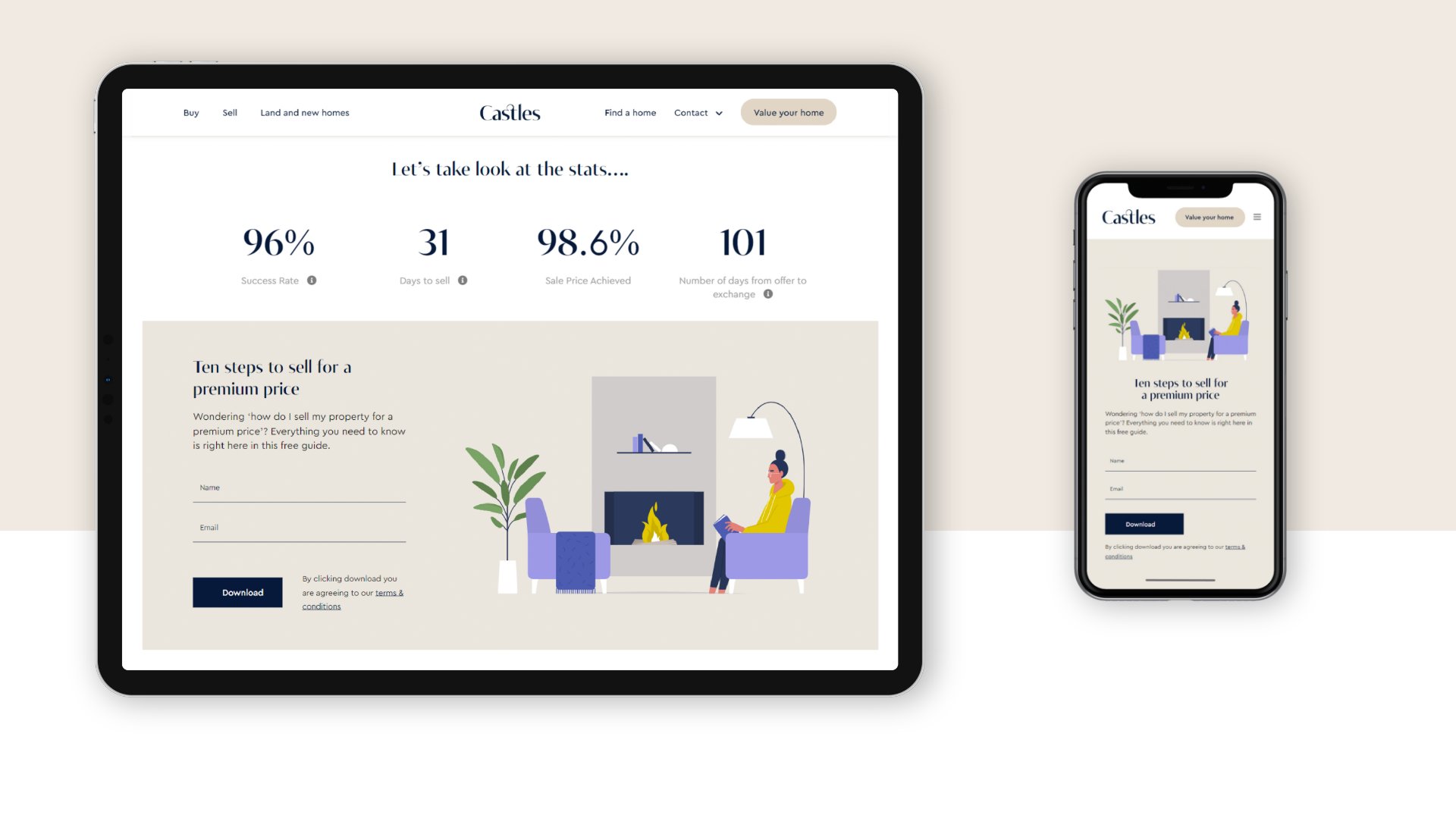
Specific features that created an easy user experience include staged forms that break complex forms into logical stages, responsive modules that take your phone’s native scroll functionality into account and cutting edge search functionality which uses Google’s auto suggestions to complete your search.
To generate more leads the website has some gated content which is a low-level commitment for the user but they gain a user’ name and email address which can be used by Castles for follow up and nurturing.
Click here to view the full website
We'd love to work with you.
We can help ambitious brands stand out and earn more with our websites and branding. Discuss a project with one of our specialists today!
Manchester
+44 (0) 333 242 0647
enquiries@propertystream.co
26 Dale Street, Manchester, M1 1FY
Find us on Google Maps
London
+44 (0) 333 242 0647
enquiries@propertystream.co
326 City Road, London, EC1V 2PT
Find us on Google Maps
Copyright © PropertyStream Ltd. 2024. All rights reserved.