
Independent estate agent brands making a big impact
In the ever-evolving world of estate agency, strong branding is key to standing out and thriving, especially for independent agencies. While national giants dominate headlines, (you can read about big estate agent brands in our previous branding blog) smaller estate agents often have a unique opportunity to create distinctive brands that resonate with local communities and differentiate them in the market.
In this blog, we showcase some of the best independent estate agency brands in the UK, as well as a selection of brands that have been adventurous and pushed boundaries with their brand.
Why estate agency branding matters
A well-defined brand is not just about aesthetics; it’s about telling a story that resonates with clients and prospects. Whether you’re focusing on trust, professionalism, your people or community involvement, your estate agency brand can be a powerful differentiator. When done right, estate agency branding can elevate a business by driving more leads, commanding higher fees, and helping you build deeper connections with your audience.
Let’s delve into some of the finest examples of estate agency branding in the UK—some crafted by our talented team at PropertyStream, and others brought to life by different creative minds.
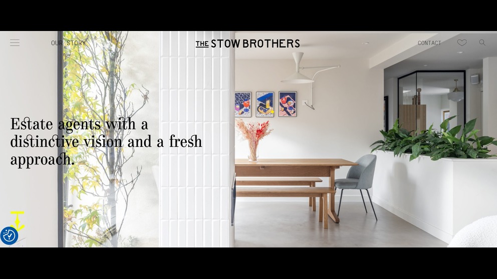
The Stow Brothers: a community-focused brand with personality
The Stow Brothers in East London have created a brand that’s all about community and personality. Their approach to estate agency branding is refreshingly down-to-earth. The playful logo and warm tone of voice make them approachable, while their focus on local expertise and customer care strengthens their position as the go-to agency in their area. Their website is welcoming and informative, with design elements that feel both modern and familiar. By infusing their branding with local charm and personal service, The Stow Brothers have made a strong impression in a competitive market, proving that a ‘best estate agent brand’ doesn’t have to be corporate or impersonal.
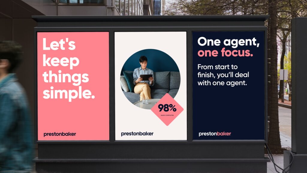
Preston Baker: fearless estate agency branding
Preston Baker, a Yorkshire-based agency, has been a trailblazer in making bold brand moves. With a refreshed identity that includes a bright pink palette and sleek diamond graphics, Preston Baker’s branding is both contemporary and bold. The brand exudes confidence, which is reflected in its award-winning tech innovation, including AI-powered selling tools. This strong, modern brand helps Preston Baker stand out in a crowded market and attract a diverse clientele. PropertyStream worked closely with Preston Baker to create their new brand and build a website that has helped redefine their image, extending their reach and visibility as a leader in the market.
Expose: absolute transparency in branding
Expose, an agency covering London and the South-East, has built its brand on the promise of transparency. Their branding is sleek and minimalist, with a monochrome base and a striking pink arrow symbolising progress and openness. This commitment to transparency resonates in every interaction, from the straightforward sliding-scale fee structure to their informative website and branding materials. Created by PropertyStream, Expose’s brand is consistent across all channels, helping to position them as a trustworthy and no-nonsense agency. Their website, also created by PropertyStream, was shortlisted for “Website of the Year” at the 2023 Negotiator Awards, this brand packs a punch.
Avocado Properties: bold and modern
Avocado Properties is a great example of a brand that isn't afraid to be different. This London-based agency has created a fun, modern brand with an emphasis on providing a fresh approach to estate agency. The vibrant green logo and playful messaging convey a sense of friendliness and approachability while still maintaining professionalism. Their brand is consistent across their website, marketing materials, and social media, offering a clear, memorable identity that speaks to their target audience: young professionals and first-time buyers.
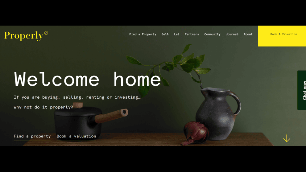
Properly – a contemporary London brand with style
Properly, a stylish London agent, is redefining estate agency with a focus on modern aesthetics, sustainability, and a commitment to community. Their branding stands out with a monospaced font - like typewriter font - that gives their website a real visual edge. This is complemented by a clean, minimalist design that appeals to a discerning clientele. The use of high-quality photography showcases stunning properties, creating an aspirational yet approachable image.
Beyond aesthetics, Properly emphasises its commitment to sustainability by donating 3% of new sales and letting fees to selected local charities, reflecting a brand ethos that values both luxury and social responsibility. Their website and marketing materials are cohesive, user-friendly, and visually appealing, reinforcing their position as a forward-thinking, ethical estate agency. PropertyStream had the pleasure of building the website for this distinctive brand.
Seymours: a premium, multi-channel brand in Surrey
Seymours in Surrey has long been a leading estate agency name in the region, and its brand is synonymous with premium service. The brand’s use of sophisticated typography and sleek design positions it as a luxury agent for high-end properties. The use of rich blues and gold accents gives a feeling of reliability and trust, while the website’s clean, user-friendly design reflects the brand’s promise of professionalism and exceptional service.
Seymours’ strong branding is woven throughout every touchpoint, making them a standout example of how the best estate agents use branding to command respect and visibility in a competitive market. PropertyStream had the pleasure of working closely with the Seymours team to build their website in 2024, one of the most advanced sites in the industry incorporating a vast range of features and functionality.

BRIK: sleek, contemporary elegance
BRIK is a super sleek estate agency based in Fulham, London, known for its minimalist, stylish approach. While the brand itself was designed elsewhere, PropertyStream had the pleasure of designing their website. The result is a clean, modern site that breathes white space, style, and contemporary elegance. With a user-friendly layout that complements BRIK's design-led ethos, the website offers a seamless experience, allowing their high-end properties to take centre stage. BRIK's online presence perfectly reflects its position as a refined, design-focused estate agency in a competitive London market.
Chinneck Shaw: local heritage meets modern design
Chinneck Shaw, a leading independent estate agent in Portsmouth and Southsea, has used its local heritage to create a brand that feels both modern and rooted in its community. The agency’s refreshed logo and website design, created by PropertyStream, borrow from Portsmouth’s maritime history, with graphic devices inspired by nautical signal flags. The result is a brand that feels timeless and distinctive while maintaining a local connection. By combining contemporary design with elements that resonate with its target market, Chinneck Shaw has carved out a strong identity that keeps it top of mind for local buyers and sellers.
Meyers Estate Agents: a fresh, ambitious franchise network
Meyers Estate Agents, call themselves the “sleeping dragon” of estate agents, presents itself as a breath of fresh air in the Dorset property market. The brand identity, initially created and continuously evolved by PropertyStream, is centred around animated animals, each representing a different value of the business. In May 2025, PropertyStream built a new website for this ambitious franchise network with real heart. Mark Meyers, with his very clear vision, is getting people talking in his patch. The brand is dynamic and full of personality, attracting attention for its creativity and its genuine commitment to community and service.
Hat & Home: a memorable name with a brand to match
Hat & Home has quickly become known for its individual approach to property marketing. With a fresh, modern brand identity, the agency uses high-quality photography and engaging content to appeal to its target market. Their approach focuses on providing a personal, hands-on service while offering design-led expertise that brings properties to life. Their website showcases a curated collection of stunning homes with an elegant and refined touch - and the name is certainly memorable and different.
Lawrence Rand: a refined brand for a premium market
Lawrence Rand, based in Ruislip, West London, recently undertook a brand refresh to elevate its market position. The brand is now centred around the concept of "powerful chemistry" with clients, a theme reflected in the modernised logo and premium colour palette of dark navy and coral red. The refreshed identity positions Lawrence Rand as a sophisticated, high-end agency, which is further reinforced through the website’s sleek design and seamless user experience, both of which PropertyStream developed.
The rebranding has helped the agency attract more high-value vendors and talented staff, proving that a carefully considered brand refresh can help independent estate agents achieve significant market share. Check out the desktop version of their homepage for the property sector’s most eye-catching animation in the header.

Moorhouse Estate Agents: local expertise with a fresh approach
Moorhouse Estate Agents, based in Sutton Coldfield, has created a brand that is grounded in local expertise while offering a modern, customer-centric approach. The branding, created by PropertyStream, reflects both the heritage and the forward-thinking nature of the business. The use of a contemporary logo created in powerful monochrome appeals to a wide demographic, and is designed to stand the test of time, as most black and white logomarks do. Think Apple. Their website, built by PropertyStream, complements their mission to make the buying and selling process as smooth and stress-free as possible. Moorhouse’s emphasis on driving results through excellent customer service, (“Sell your home for more, with Moorehouse”) combined with their modern branding, has allowed them to carve out a strong presence in a competitive local market.Mr & Mrs Clarke – the discerningly different estate agency
Mr & Mrs Clarke – the discerningly different estate agency
Mr & Mrs Clarke is one of the brands that redefined estate agency with a focus on personality, storytelling, and a modern, boutique approach. Rather than the traditional transactional model, they emphasise connecting people with homes that resonate with their lifestyles. In tune with their name, their branding is characterised by a warm, inviting aesthetic, featuring hand-drawn illustrations and a distinctive logo that sets them apart in the market, and matches their name. The website brings their unique approach to life online, showcasing their personality and offering a refreshing alternative to traditional estate agency marketing.
Simmons & Son: love it or not, this bold brand produces results!
Perhaps a bit of a marmite brand—Simmons & Son in Slough is turning heads for sure, bright and bold, and the new name and brand refresh have produced incredible results. Previously B. Simmons & Son, this rebrand in Slough illustrates how a fresh identity can make a significant impact. The agency shortened its name and modernised its logotype while maintaining a connection to its heritage. The new branding features a vibrant “S” mark and a bold colour scheme, helping Simmons & Son resonate with younger movers and higher-end sellers. The results speak for themselves: website traffic up 90%, a ten-place jump on Google, and a significant increase in market share. This rebrand, which included both the branding and website development by PropertyStream, showcases how even small adjustments to an estate agent’s brand can lead to substantial business growth.
Aucoot: the epitome of class and style
Aucoot is the epitome of class and style, with a brand that looks more like a designer label than an estate agent. Their branding combines design appreciation with industry-leading property experience, where every home they sell is presented with bespoke care, led by prominent interior photographers and creative writers, ensuring a level of presentation that sets them apart. Aucoot is a standout brand in the luxury property space.
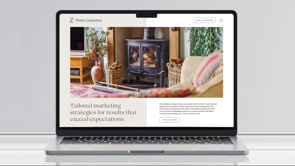
Peter Greatorex Unique Homes: timeless elegance
Peter Greatorex Unique Homes, serving Bath’s premium market, has refreshed its brand to reflect elegance, professionalism, and precision. The modern, refined design appeals to high-net-worth individuals, positioning them as the go-to agent for discerning clients. PropertyStream updated their brand through copy, design, and tone of voice, solidifying their presence in the competitive luxury market. Considered one of the best estate agency websites of 2025 in terms of style and sophistication, Peter Greatorex exemplifies modern elegance in branding.
Branding for independent estate agents: key takeaways
Independent estate agents don’t have to compete with the big names by imitating them. Instead, they should focus on creating a unique, memorable brand that resonates with their values and their target market. Whether it’s through bold design, a clear message, or a community-focused approach, a well-crafted estate agent brand can help smaller businesses stand out in a crowded market.
By defining your agency’s core values and ensuring consistency across all touchpoints—online and offline—you can create a brand that not only attracts more clients but also helps build long-term trust and loyalty.
If you’re looking to refresh your estate agency brand or create a website that stands out, PropertyStream is here to help. Our branding team would love to have a chat about how we can help step-change your brand and business. Contact us today.