
Relocation Agent Network
A modern visual identity that the network members can be proud to be part of.
The Summary
We recently updated the branding for one of the property industry’s most respected and cherished networks – the Relocation Agent Network. We have created a new logo, fresh brand and designed the new RAN website which is due to launch shortly.
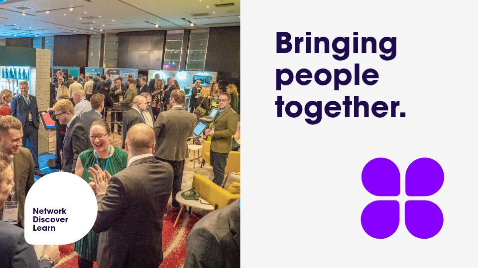
This network is made of hand-picked Members and attracts some of the best, most respected independent estate agents in the UK who work collaboratively to support home-movers across the country with trusted advice and local knowledge.

The Brief
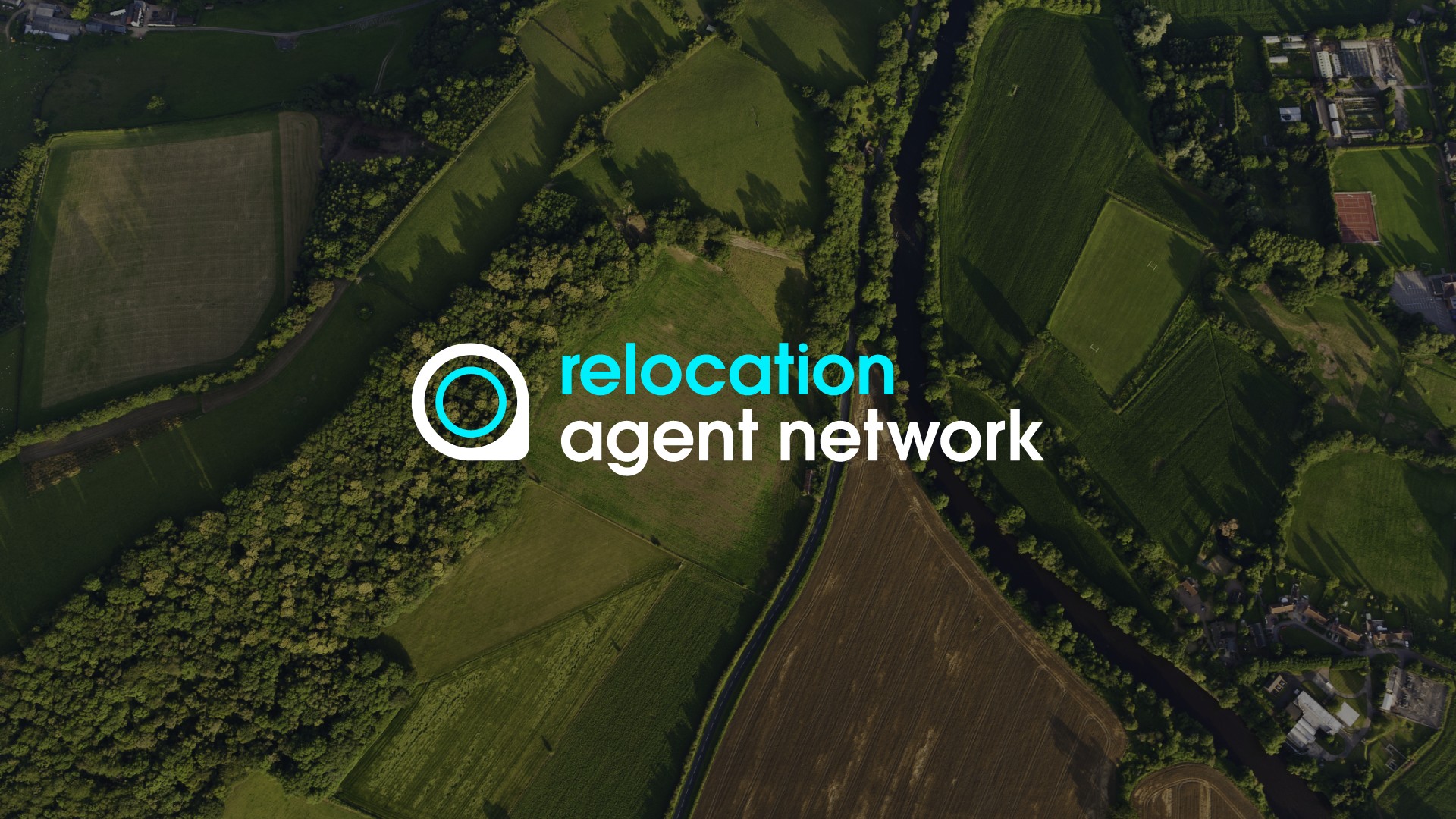
Relocation Agent Network is known for quality. But the brand did not reflect this. It was tired and dated. It needed to be modernised and refreshed.
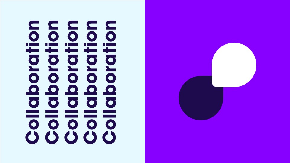
The brand needed to express how the network Members, the estate agents, collaborate for the greater good of the customers – people who relocate in the UK.
We were asked to bring the brand into the 21st century and create something that all the estate agent Members and the RAN team could be truly proud of.
The logo needed to be versatile so it could be positioned on the different coloured backgrounds of all their estate agent Members. Members frequently use the RAN branding on their own website and in marketing materials to showcase their involvement in this prestigious network, helping even more people move across the UK.
It was important not to lose the brand authority and recognition for RAN as an established and highly recognised player in the UK property industry.
Our Approach
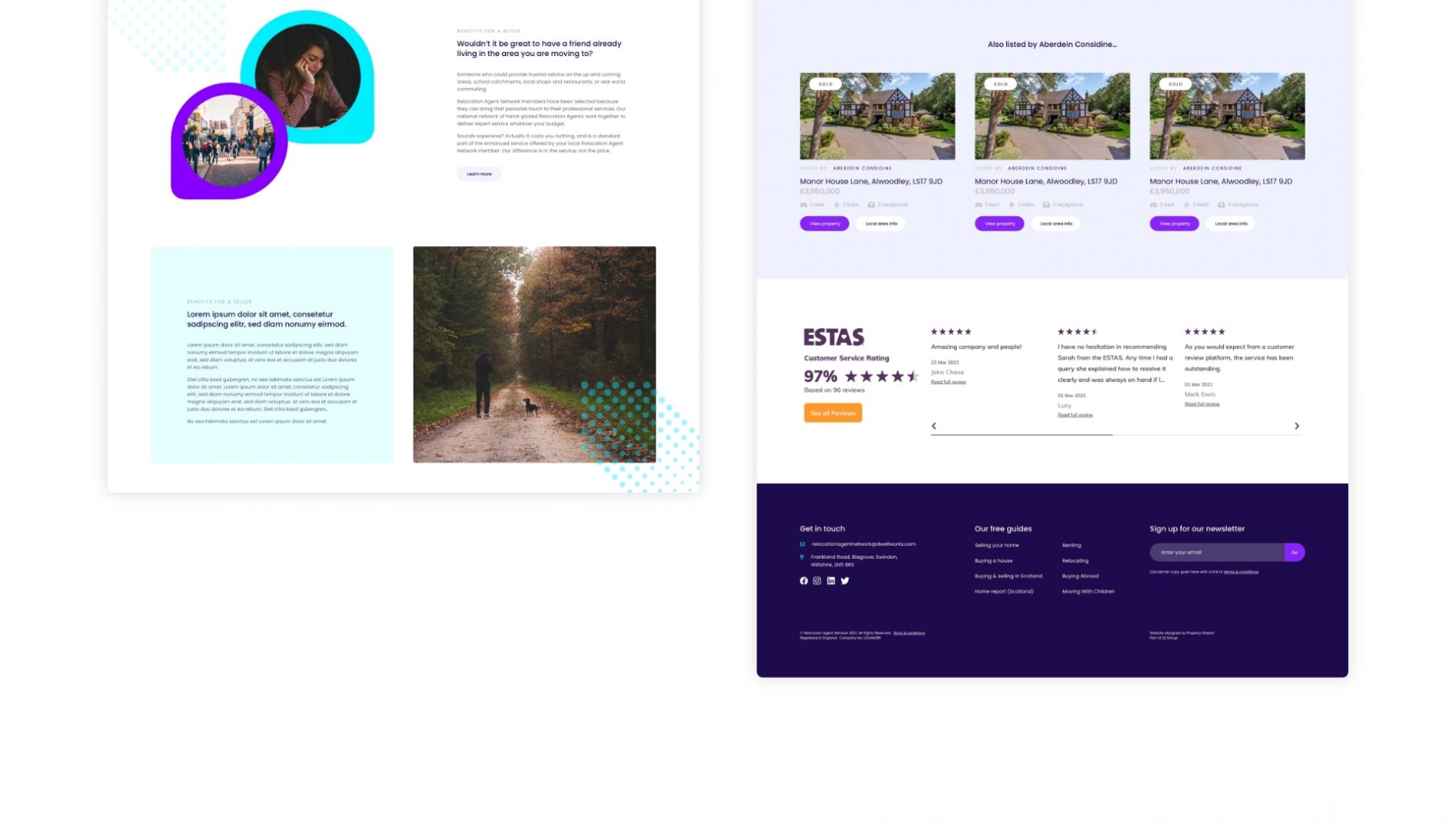
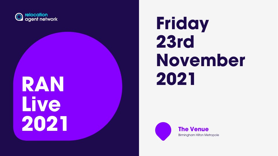
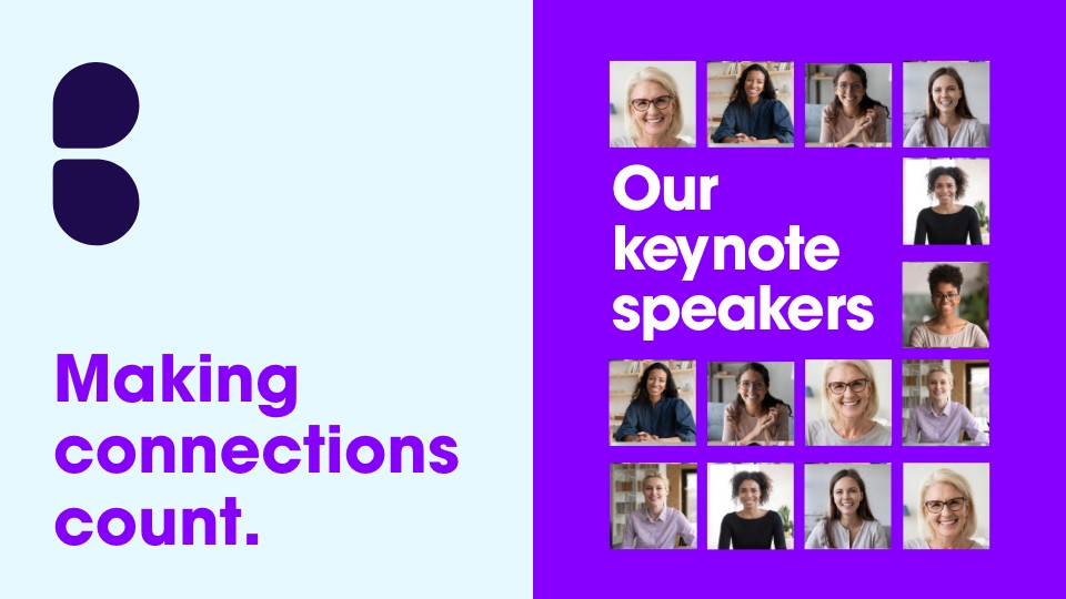
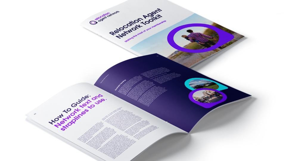
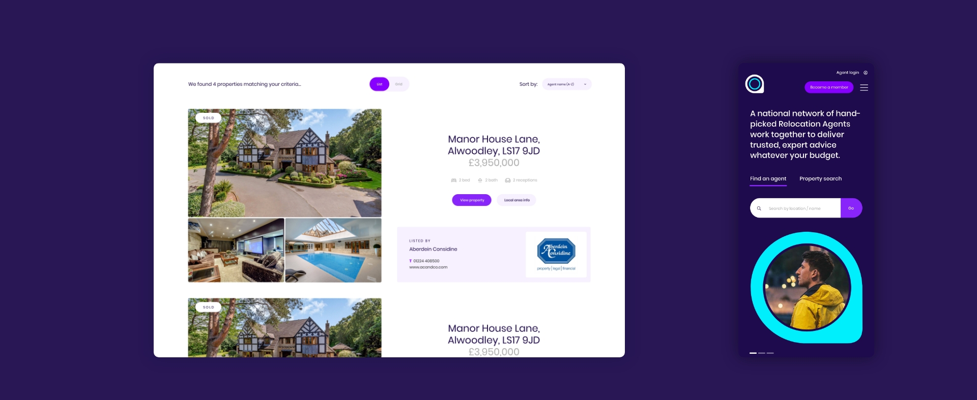
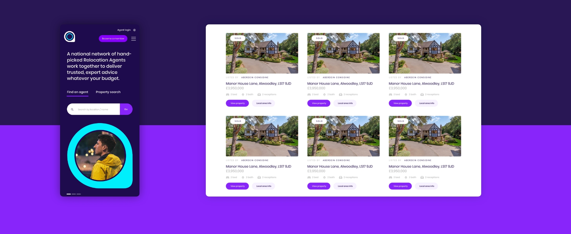
RAN were looking for striking and eye-catching graphics and imagery to lift and elevate their brand. Our creative team of brand strategists and designers worked on the logo, visual language, image style, graphics, website designs as well as the branding for the RAN Annual Conference.
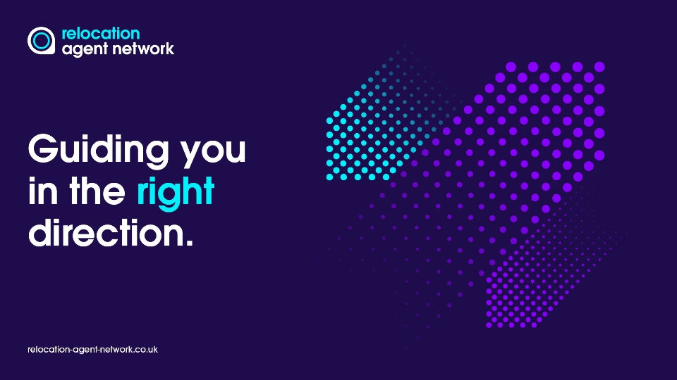
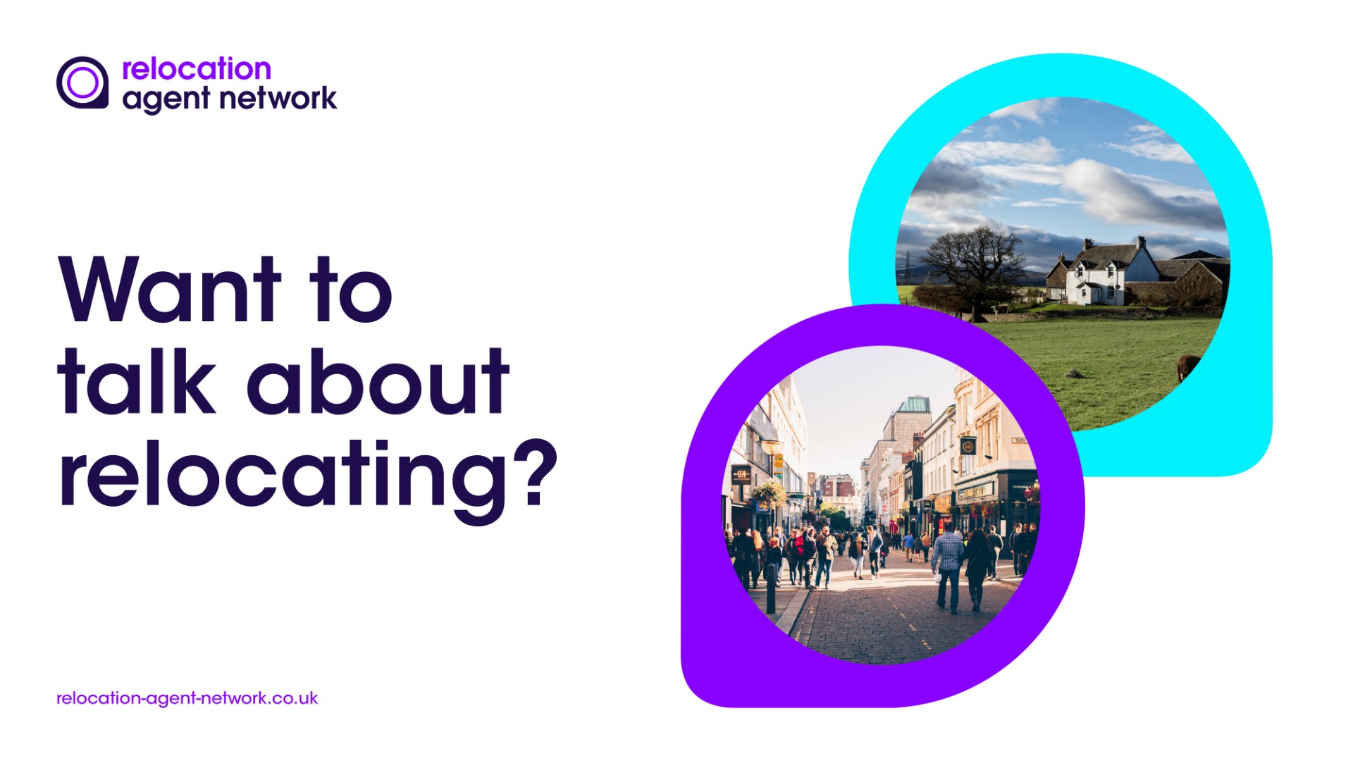
We’ve adopted a vibrant colour palette for a fresh new look. We removed the over-complicated layouts and some out-dated graphics and images. A more modern typeface has been adopted and we evolved the pin-shaped icon that is a much-recognised feature of the RAN brand.
The Result
Relocation Network Agent now has a modern visual identity that the network members can be proud to be part of. And a brand that the RAN team can feel proud to work for.
It’s a logo and brand that will last for many years to come without dating.
There are significant links to the previous identity to ensure brand value and brand recognition is not lost. It is now easier to understand messages within the visual identity.
The use of more emotive and natural imagery helps depict the end-user’s journey when relocating to a new area. Through the brand, we demonstrate how people feel during their moving experience; how people are happy in their new area and home and how this has been made possible with the expert help of the outstanding estate agents that are part of RAN.
Features & Deliverables
Various colour variants have been used to ensure the logo and brand work on different backgrounds, including a monotone and an all white version. The recognised RAN blue has been darkened which immediately lifts the brand and makes it more stylish and modern.
We have created striking directional graphics to represent movement and relocation. We have made it easier to read text at smaller sizes.
The new website designs are fully optimised for mobile and ensure compatibility and accessibility with any device.
We'd love to work with you.
We can help ambitious brands stand out and earn more with our websites and branding. Discuss a project with one of our specialists today!
Manchester
+44 (0) 333 242 0647
enquiries@propertystream.co
26 Dale Street, Manchester, M1 1FY
Find us on Google Maps
London
+44 (0) 333 242 0647
enquiries@propertystream.co
326 City Road, London, EC1V 2PT
Find us on Google Maps
Copyright © PropertyStream Ltd. 2024. All rights reserved.