
Brock Taylor
A visual identity that matches their bold campaigns.
Background
Up and running since 1992, Brock Taylor is a family-run, independent estate agent with a long history of success. They have cultivated an ethos built upon honesty, proven success and attentive customer service, with their strong family values underpinning everything they do. Under the management of Peter and Lucy Maskell, who between them have over 50 years of estate and letting agency experience, Brock Taylor have become market-leaders in their area, consistently out-selling their competition.
The Brief
Brock Taylor gained a name for themselves through their punchy marketing campaigns, but their branding was in desperate need of a revamp. Strong and creative ideas were restricted by an inconsistent and dated style.
Enter PropertyStream…
We met this challenge head-on, with a bold yet contemporary brand refresh.

Our approach
And there it was: the perfect brief. We had the opportunity to unleash our creativity onto this brand and to transform it into something wholly new, bold and unique. Our approach was twofold…
Clever copy
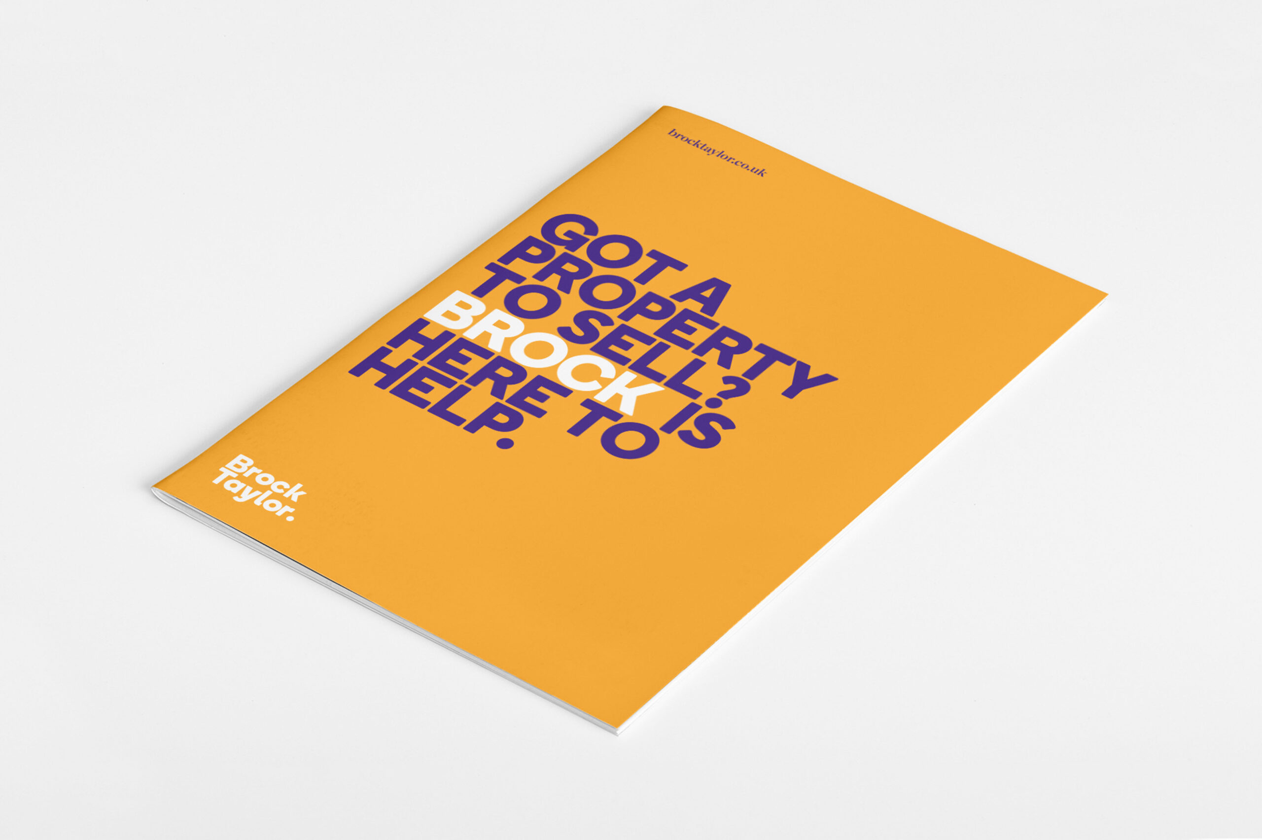
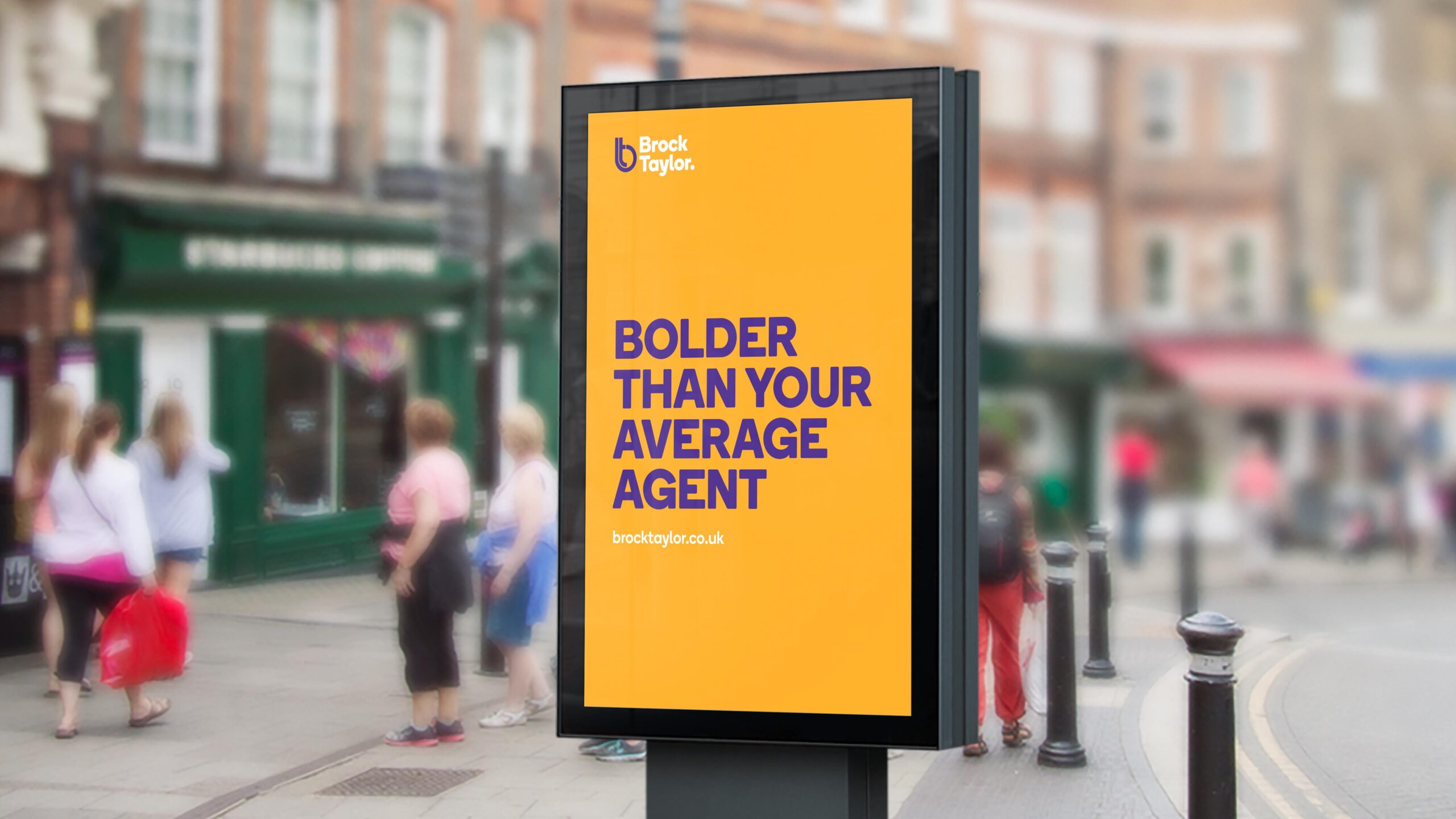
Our copy always aims to echo our design. With Brock Taylor, we chose to represent ‘Brock’ as a person with streamlines such as ‘Brock makes it easy to sell your home.’ This writing style created an approachable character that would fit in with our clever branding. Our strapline was the finishing touch to a job well done. Tying in nicely with our neon design, our strapline ‘A Bright Choice’ bridged the gap between style and content and completely represented our finished brand.
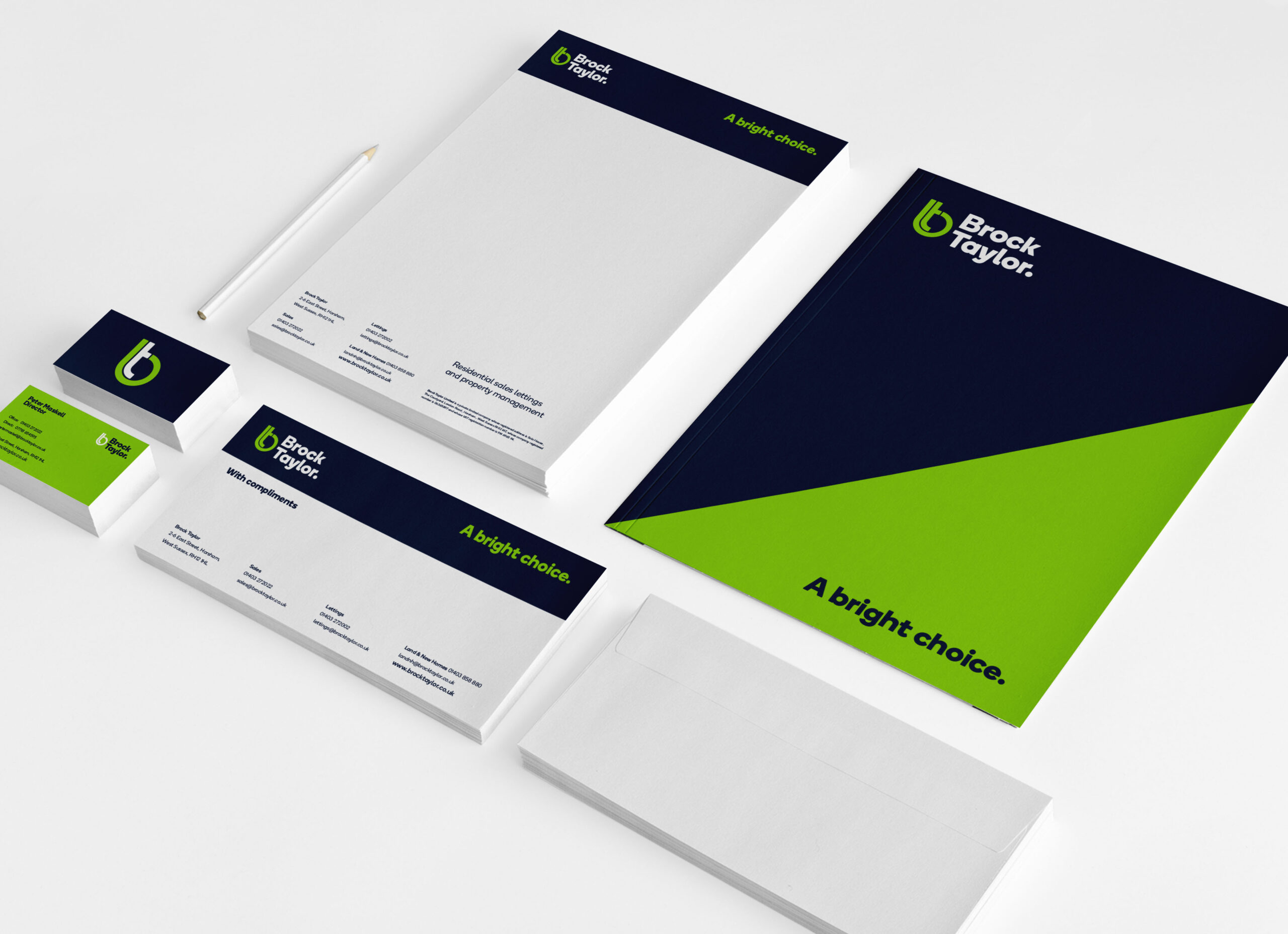
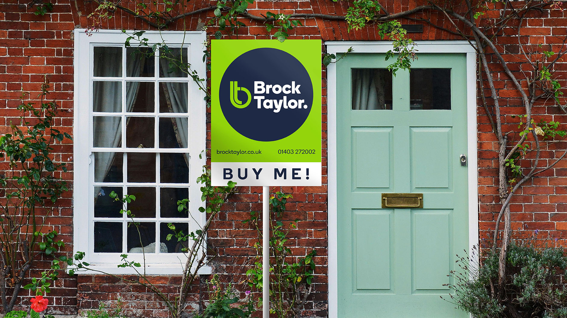
Design
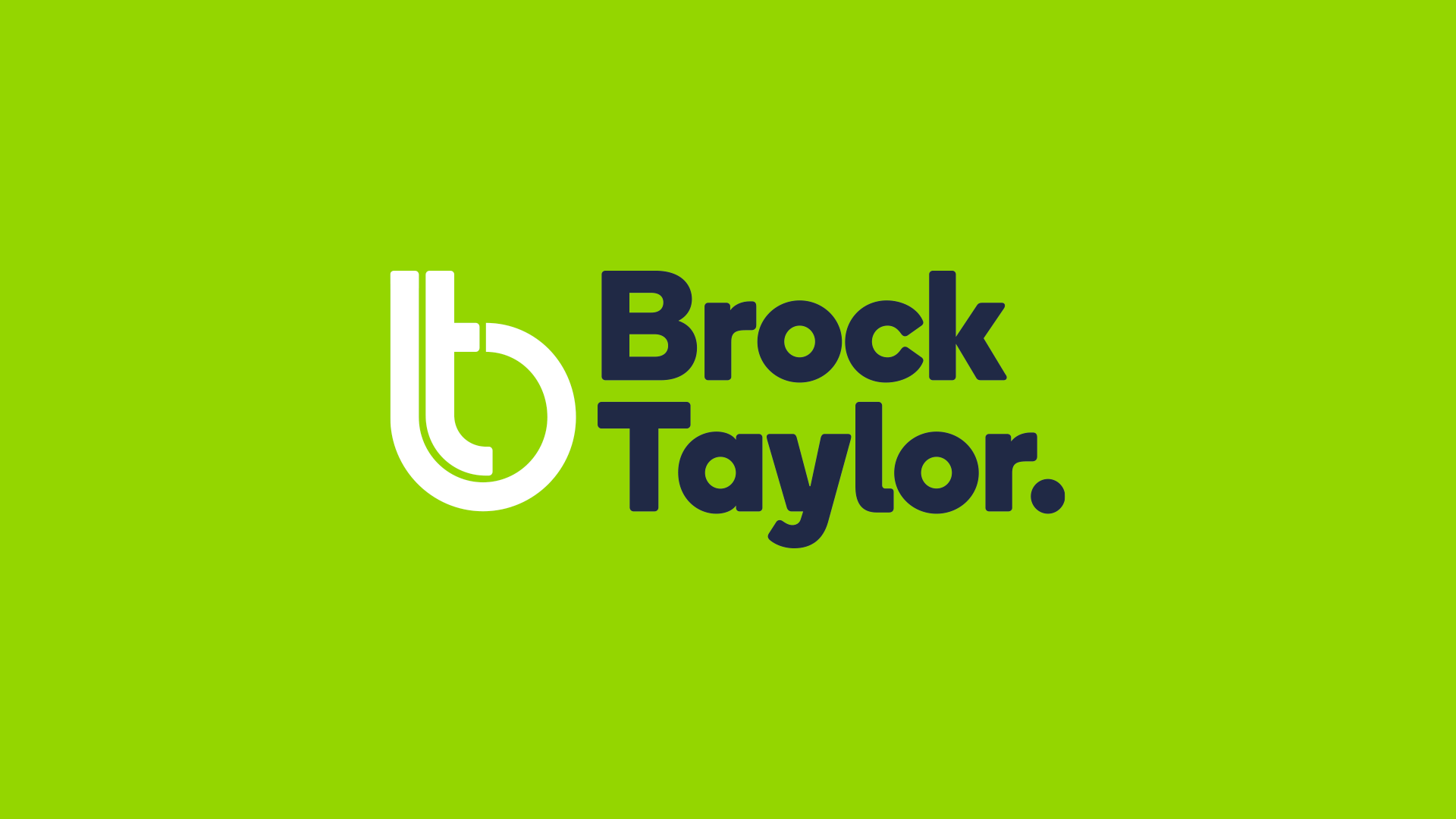
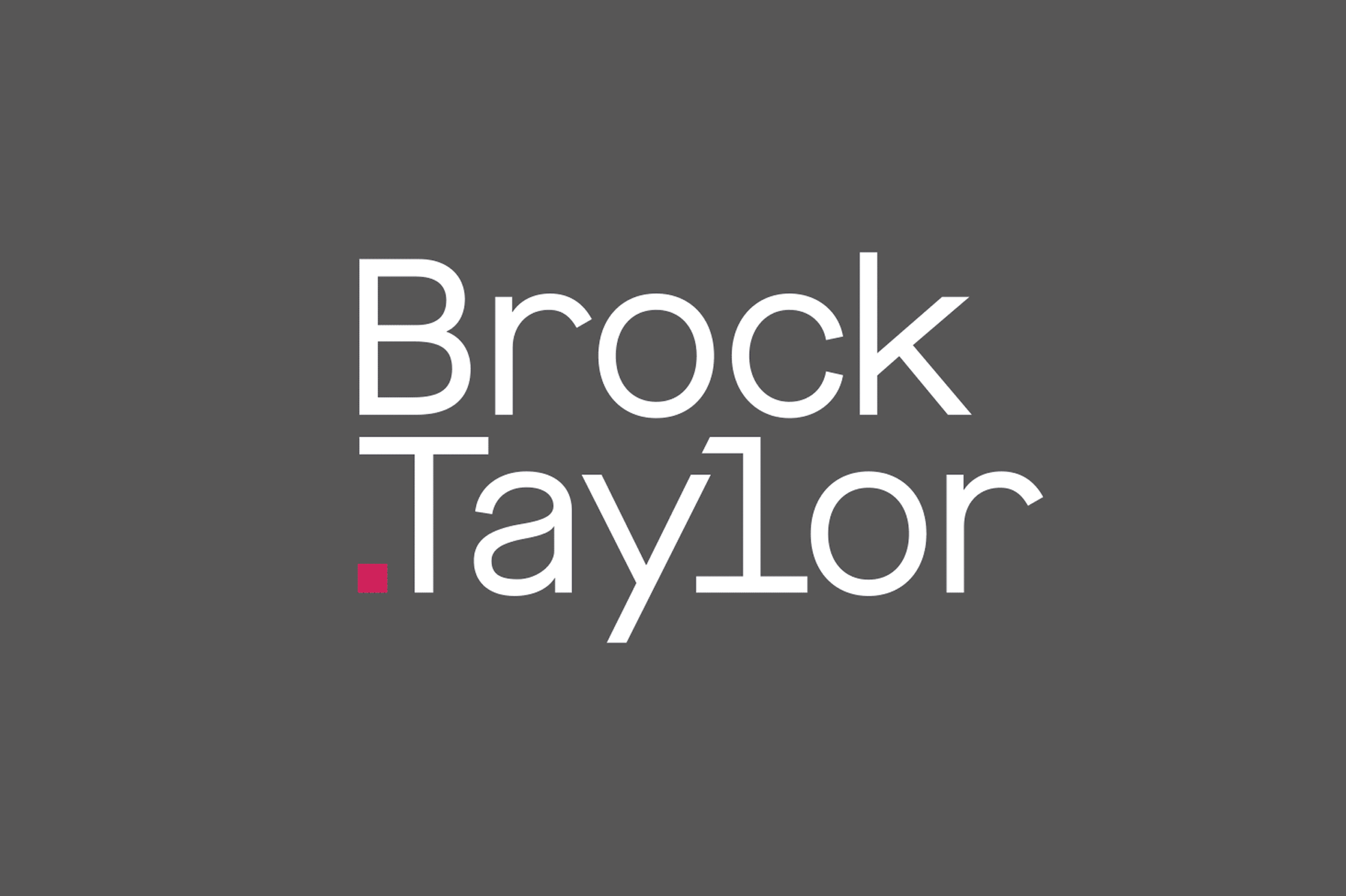
Our design was the most obvious and striking element of our approach. Big, bold and bound to get noticed! Inspired by a vivid neon colour scheme, we offset this against a dark contemporary blue. The result? Eye-catching and modern: an instantly recognisable logo and brand. Our clever typography made a strong impression. We preserved the green of the original branding, but made it bolder, brighter, newer. Our contemporary font choice kept the style current. And the creation of an inspired monogram logo marque, interlinking the ‘B’ and ’T’ of Brock Taylor, was a unique identification mark for our clients, guaranteed to get them noticed!
The result
Our result and theirs: a visual identity to match their bold campaigns. We supplied Brock Taylor with strong branding that would continue to get them noticed, for the right reasons. We are really proud of the amazing way we answered this brief and the result we created – one of the boldest, brightest brands in the industry and true market-leaders.

Click here to view full website
We'd love to work with you.
We can help ambitious brands stand out and earn more with our websites and branding. Discuss a project with one of our specialists today!
Manchester
+44 (0) 333 242 0647
enquiries@propertystream.co
26 Dale Street, Manchester, M1 1FY
Find us on Google Maps
London
+44 (0) 333 242 0647
enquiries@propertystream.co
326 City Road, London, EC1V 2PT
Find us on Google Maps
Copyright © PropertyStream Ltd. 2024. All rights reserved.