
In the design world, we preach incessantly about helping our clients stand out from the crowd and being original. Like it is the only thing that really matters.
At PropertyStream, Standing our clients out from their competitors and getting them noticed is something we have a proven track record off, and is part of our methodology. But there are other factors involved when deciding on a look and feel for a visual identity. One of the key things that creatives are steered by is trends. And here is an amazing example, of how the worlds largest and most successful brands have paid millions to be... well....rather similar!
The brand elite such as Google, Airbnb, Spotify, and Pinterest have in the last 4 years shifted from bespoke serif typefaces to a more uniform sans serif logotype. At Property Stream, we have followed a similar direction.
At first, I was a little hesitant, but a couple of months on from our own rebrand, I don't regret the decision to follow the trend and change our logotype, and here's why:
-
Being seen as contemporary can go a long way and tops being different for difference sake.
As long as you don't look similar to your close competitors, having a similar look and feel to brand disruptors and innovators from other sectors can work wonders for your own reputation.
-
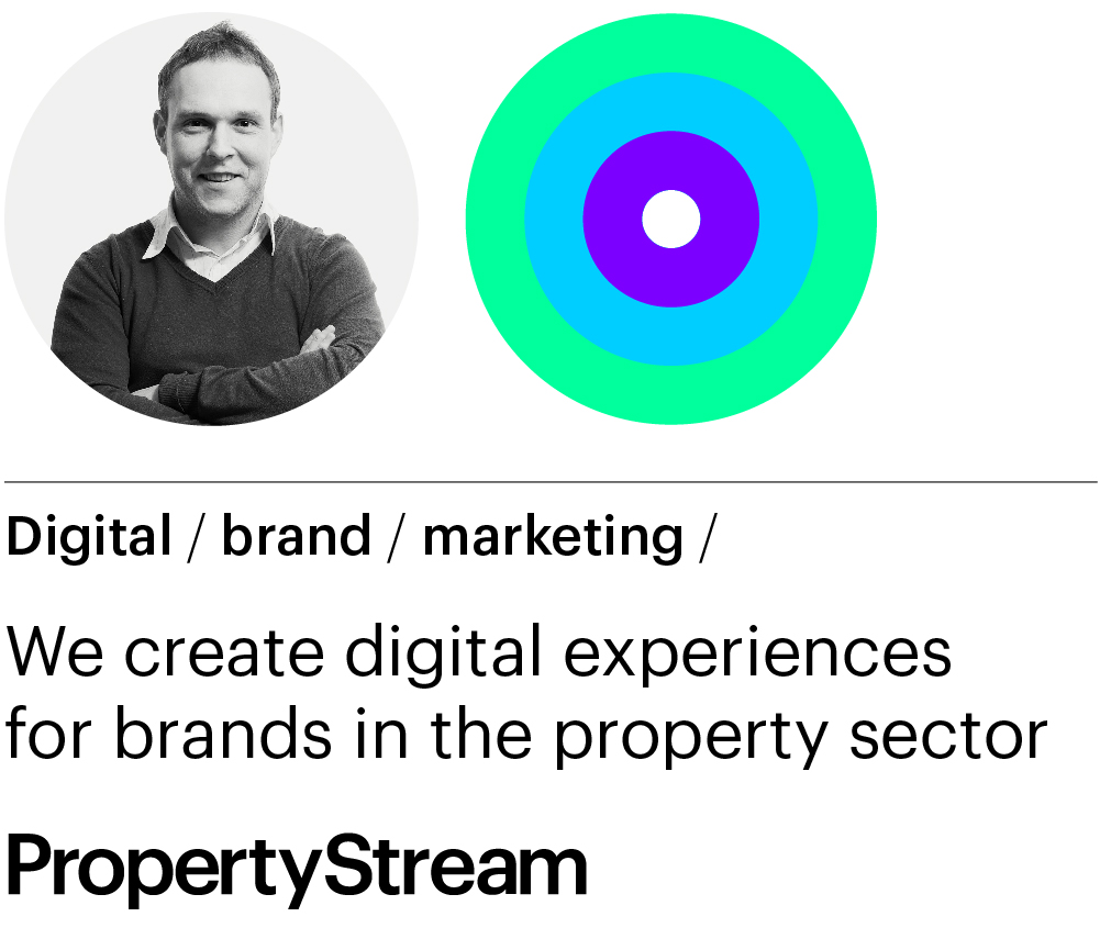
In terms of our PropertyStream brand refresh, as well as updating the typeface we have also changed the logo marque to something very different from other brands in our sector. The move to a more neon colour palette really stands us out, particularly on social media.
-
In Summary, being different can be hugely powerful in terms of getting you noticed, but as long as it is not at the detriment of style, and current public perceptions. The holey grail is being different but also contemporary and cool.
If you can achieve that you are onto a winner. That being said, a logo that is timeless, and stays in vogue with very little tinkering, is the real holey grail. If I say so myself, our 22 Group logo fits that bill. We have changed the colours, over the last 7 years, but the logo marque is unchanged. That's down to pure simplicity.
If you would like a second opinion on your own brand, please give me a shout on robin@propertystream.co or ring me on 0161 672 7822